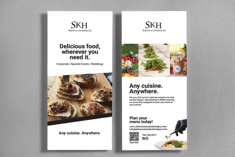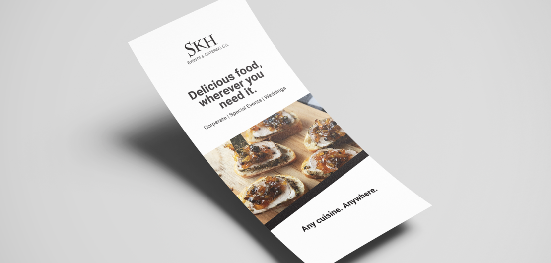
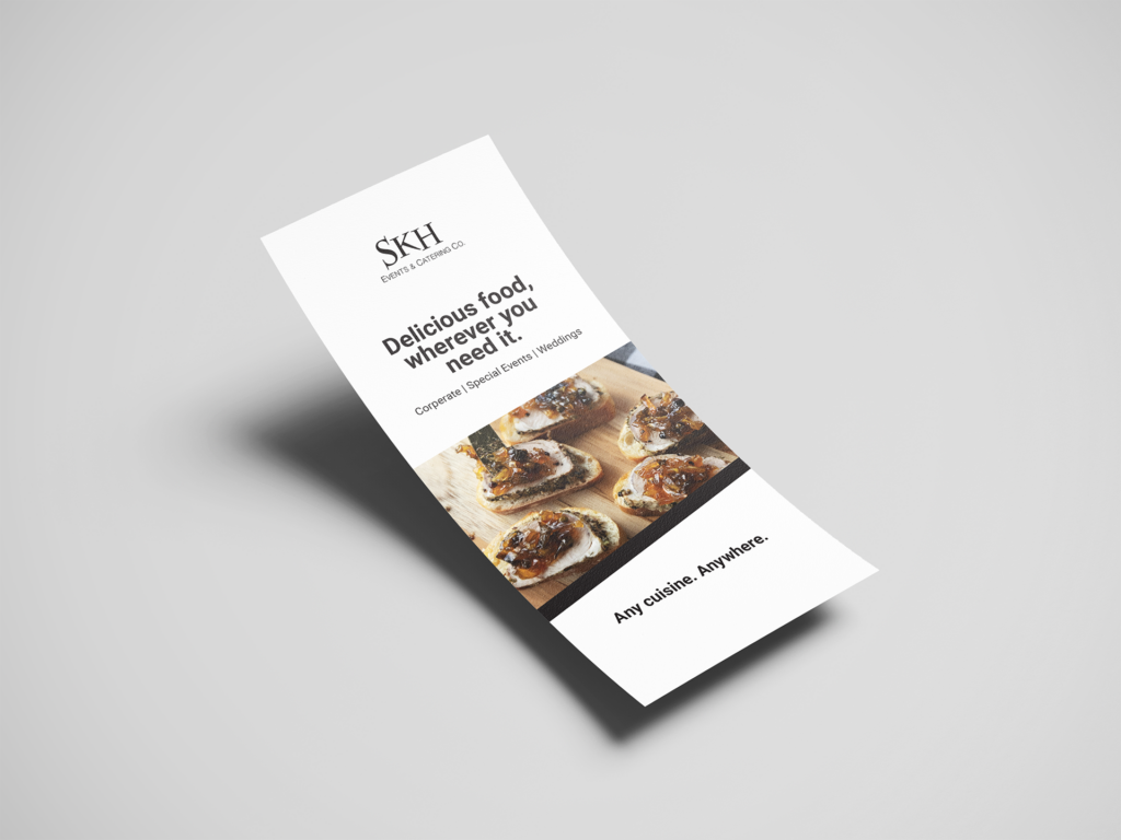
SKH wanted a way to reach new markets and communicate their versatility. I researched and met with them to help focus their marketing efforts. I worked with a team to develop a solution, ultimately designing a rack card to distribute to local venues.
This food-focused design showcases SKH’s stunning catering services, emulates their brand, is attention-grabbing, and uses effective language to communicate key messaging. The colour, type, and messaging used are consistent with SKH’s established brand. It’s eye-catching and will stand out among other marketing materials. The key messaging is simple and clear. It emphasizes SKH’s flexibility in cooking any cuisine and at any location.